
With the start of the summer, we are getting into a vacation mood at UXprobe. Low-cost airlines are all the rage right now, so we are set on flying with them to our next tropical destination. But which one should we choose?
To help us find an answer to that question, we performed some remote UX tests (or call it web testing) with our new tool to see how people would order flight tickets online. And we have some interesting results to share.
All the results are available in the full study that you can download for free
Through our testing, it became clear to us why Ryanair is such a strong performer, while also having recommendations to improve website usability for all three tested airlines (Ryanair, Brussels Airlines & Easyjet).
Remote UX testing — video recordings of people visiting your website and talking about their experience — cannot only help finding out which low-cost airline is the most user friendly. It also provides companies with a powerful tool that they can use to gather insights, find usability issues, easily compare their websites against the competition and help them get greater online revenue.
Let’s see how airline website can reach new heights (pun intended) in usability!
Up, Up and Away!
The popularity of low-cost airlines is rising quickly. Right now, already 35 % of all passengers in European airflight are flying with low-cost.
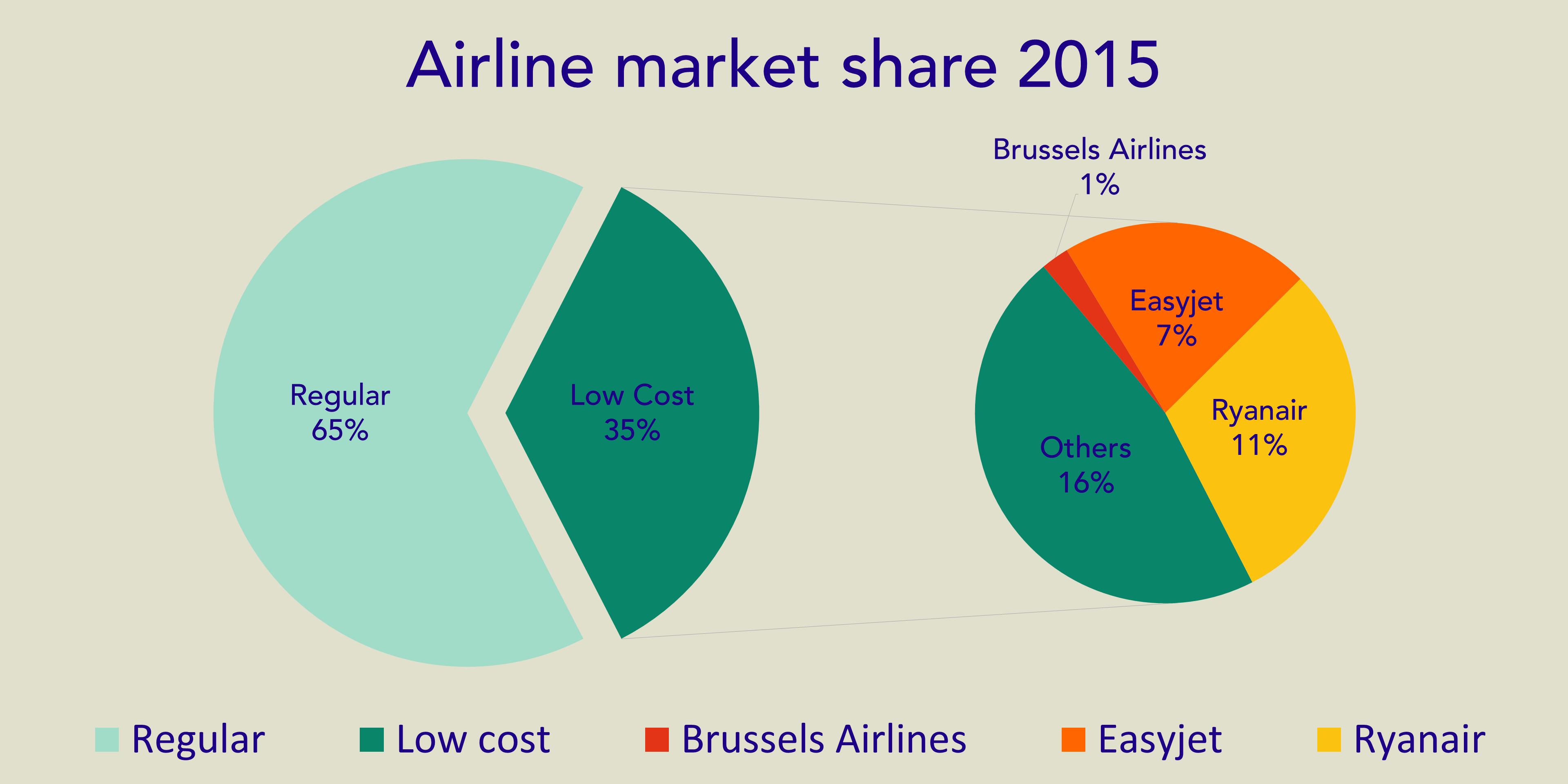
And from that 35 %, there are 2 clear leaders: Ryanair & Easyjet.
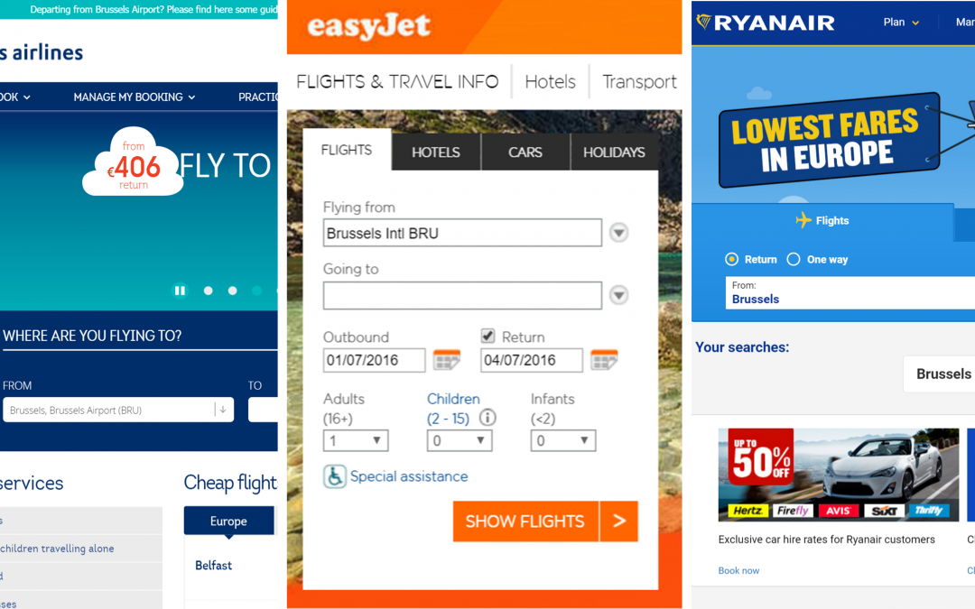
Now, we are proud Belgians, so we couldn’t leave Brussels Airlines out of the picture. This was also an interesting opportunity to test if ordering a ticket from an airline’s headquarter (Brussels Airport) would be easier.
Through our UX remote testing, we found usability issues in the following areas:
All the usability issues are available in the full study that you can download for free.

|

|

|

|

|
Loyalty programs
Don’t get us wrong, loyalty programs are a good thing! They help companies increase sales and can provide more value for an existing customer. But for new customers, if you don’t provide adequate information or don’t use terms that are straightforward, a loyalty program can kill a sale.
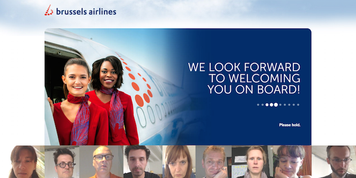
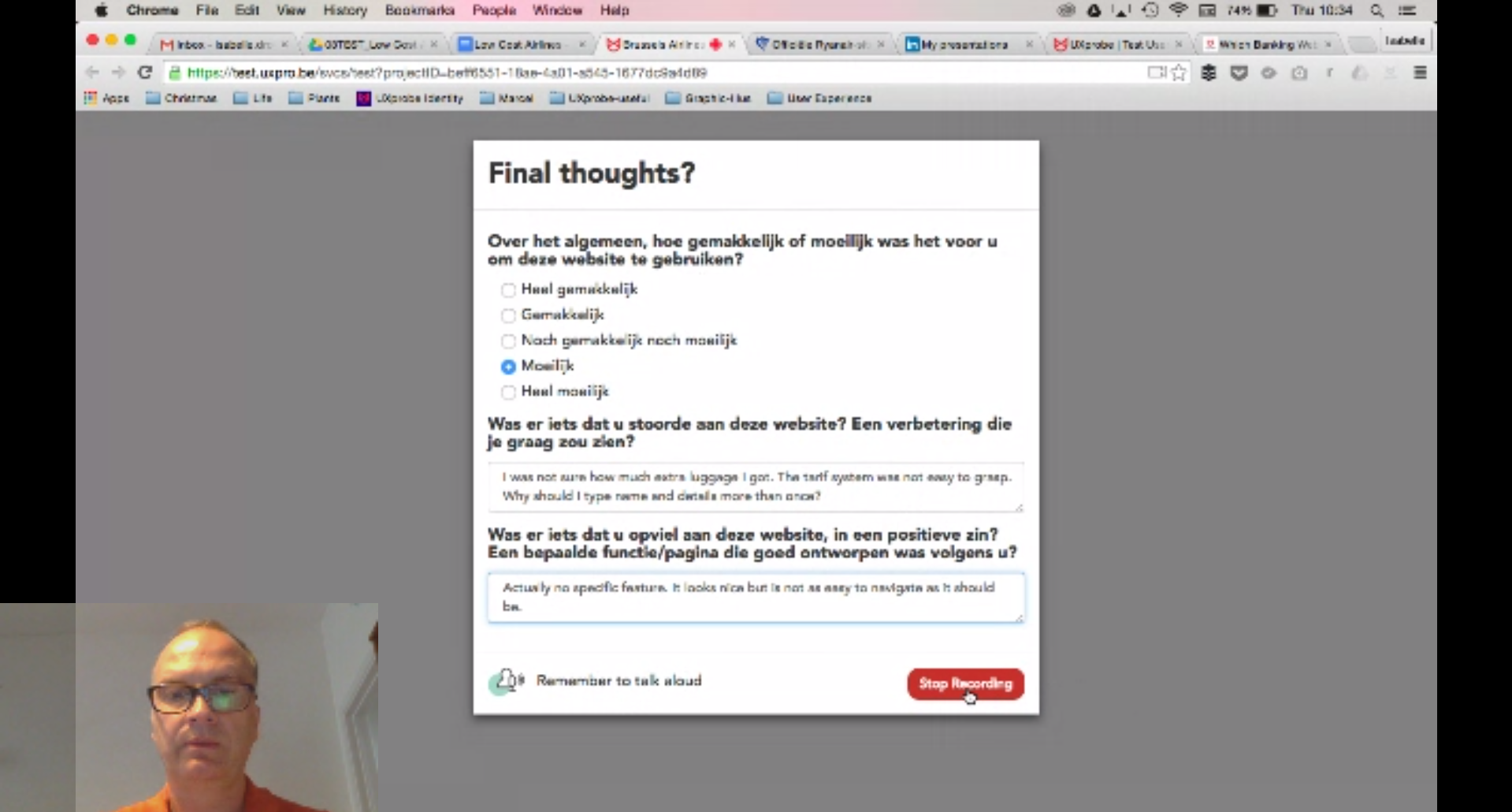
Brussels Airlines is proud of its’ loyalty program called Loops and therefore (rightfully) puts it as one of the options on the front page, after choosing a departure/arrival date. But most of our testers became confused by the option and decided to leave it unchecked when ordering a ticket (instead of, for example, looking for more information about it).
If you doubt that option would ever lead to a lost sale, then look at the reaction of someone who becomes frustrated after checking the loyalty program option because he can’t find a good way to revert back to Euro. He eventually quits the task.
You need to consider every option when testing your website and how that could affect your customer, both new and old.
For more usability issues, you can download our full study for free.
Language use
As we already mentioned in our previous blog post (“Which Banking website is the most user-friendly?”) , your website’s language use can either cause joy or confusion with customers.
Ryanair is a bit more playful than others, showing a “Daar gaan we!” (Here we go!) button to start the ordering process. It might seem trivial, but our testers noticed, and liked it.
Using such terms can have a positive effect on your website’s satisfaction rate. It is this kind of language, combined with other factors, that probably put Ryanair on top in our satisfaction survey, performed after each test.
On the other hand, confusing terms prevents users from achieving their goals, increasing dissatisfaction. It can even lead a company to lose extra revenue.
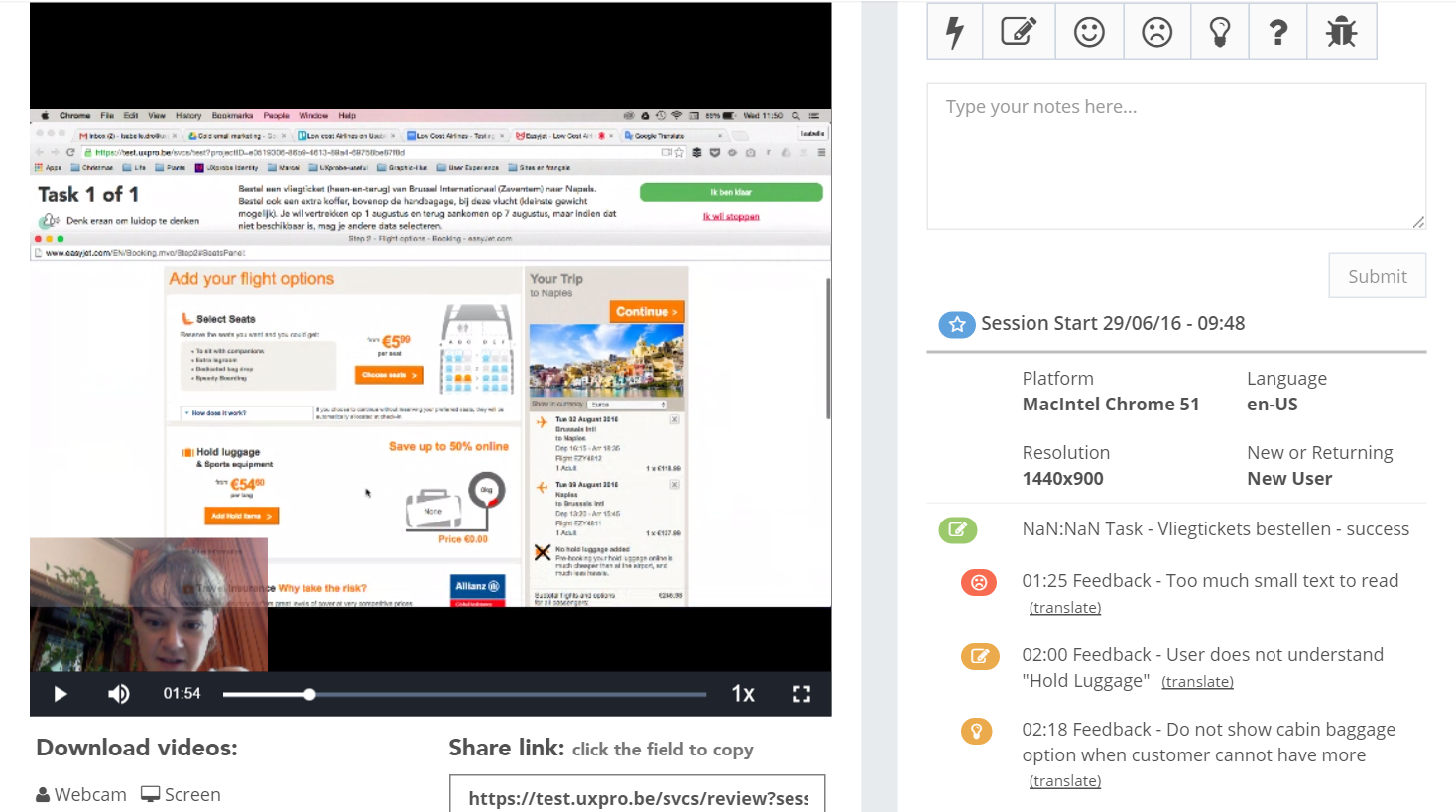
Easyjet uses “Ruimbagage” (“Hold luggage”) for the extra luggage you can order (that isn’t hand luggage). But for our testers, that term was confusing.
Watch as our English tester thought she needed “Cabin Baggage” (the term being used for hand luggage) and eventually did not select anything.
Our Dutch tester is confused when first reading the term, then selects “ruimbagage” hesitantly.
For more usability issues, you can download our full study for free.
Loading times
Ordering a flight ticket might seem like an easy task, but there is a lot of work being done in the background: checking seat & flight availability, creating new accounts, order processing, etc.
Speed is key if you want to increase your customer satisfaction. If you have a slow website, chances are your customers won’t come back.
To avoid confusion, you can make it clear to your customer that they need to wait while a request is being handled, create some kind of distraction. But it won’t magically solve your slow website.
Brussels Airlines uses a splash screen, but by showing it at almost every step, our testers started to notice, defeating the purpose of creating a distraction during load times.
In the questions presented afterwards by our tool, where they could fill out both positive & negative points about the website, over half of our testers still found the website to be slow and the splash screen distracting.
For more usability issues, you can download our full study for free.
Product options
You might have experienced it before: you order a return trip flight, select your seat, but the site suddenly says you selected two! Ah yes of course, 1 seat for the flight there and another one to come back.
Airlines have struggled with wording this correctly, sometimes you pay extra for your seats in low-cost, so the customer should be notified about it. But sometimes, airline companies can’t get the message through.
In the video below, you can see a tester struggling to find out why she ordered two seats, even suggesting starting the task all over again.
If she would indeed have restarted the task, you would have noticed it in your analytics tools’ event flow. But only with usability testing you would have found out exactly why she restarted.
For more usability issues, you can download our full study for free.
Pricing
Low-cost airlines provide low fares. For everything else, you pay an extra fee. That’s not a bad thing, it has become a great business model for some companies.
However, great power comes with great responsibility: if you must charge an extra fee, you should be transparent about it. But what exactly does that mean? When do you show that you are charging an extra fee?
For some of our testers (you can watch the video for one of them below), the notification of a surcharge (8€) for paying with credit card came way too late.
In her answer to the questions presented after the test, she wrote this:
“The 8€ processing fee at the end is super annoying. I hate feeling like companies, especially airlines, are adding on tons of little extra charges. I already expect more to come when I arrive for my flight, which is going to be annoying…”
If she would have switched payment options you would have noticed it in your analytics. But was it because she pressed the wrong button? Or because your website did not have the right credit card options?
With usability testing, you would know the exact reason and make meaningful changes because of it.
For more usability issues, you can download our full study for free.
Interface & Pop-Ups
We all know it: pop-ups are annoying, but sometimes they are used to show useful information.
In the case of airlines, popups were used to explain the different (luggage/pricing) options. But a bad implementation could cause confusion or even give the impression to your customers that your site is not working correctly.
The tester below (and most others) becomes increasingly annoyed about a pop-up that gets activated automatically when hovering over a luggage option, while he actually just wants to scroll downward on the page.
For more usability issues, you can download our full study for free.
Airlines can always do better!
The users had a generally positive experience in ordering their plane tickets in light of the coming vacation time. However, from our usability test and interviews, we realise that these airlines do have room for improvement in automating their services to serve their customers better. Using usability testing, we found out the areas to consider for improving their websites, and it is indeed a good start to better treat and retain their valued customers.
Convinced you need to test your website as well?
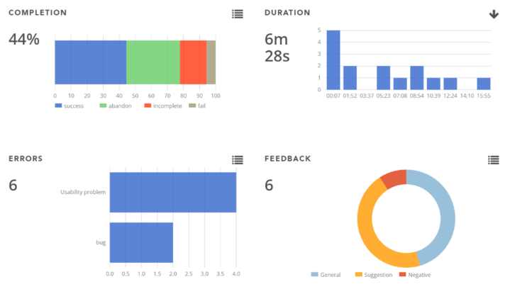
Website testing on different screens, different OS’es & different browsers is a must for good UX design. Our tool shows all of that information for every test. That way, a company could quickly check if this problem is platform/browser specific and fix it immediately.
This is done easily with our new usability tool from UXprobe:
UXprobe video review shows you the test user’s video and you are able to write feedback on the right side.
UXprobe Tasks allows you to see the analytics behind the tests
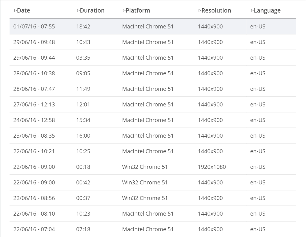
UXprobe session overview compiles all the test users data in one list
After reading these findings, do you want to know if your website can be improved as well? Are you curious to know if we have a free trial? Do you want to experience a test for yourself? Or do you just want to jump right in and take a look at our pricing?
Well, all of that is possible at UXprobe! You can get in touch with us and we’ll be happy to answer any question you might have.
ABOUT THE AUTHORS
 |
Timo Verbrugghe Content Marketing |
 |
Albert Bingei Content Marketing Trainee |
Tests were conducted between 22nd of June & 1st of July 2016 on 9 participants. Participants were chosen randomly. UXprobe is an independent company and did not perform these tests under the commission of Brussels Airlines, Ryanair or Easyjet.
Acknowledgement: Icon made by Freepik from www.flaticon.com